Die Lernkarte ist eine flexible, in sich geschlossene visuelle Einheit, die dazu dient, ein einzelnes Lernelement – wie beispielsweise einen Kurs, einen Lernpfad, eine Vorlage, ein Medienobjekt oder eine News – in einer Liste oder einem Raster anzuzeigen. Jede Karte ist so konzipiert, dass sie eine kompakte Zusammenfassung des Inhalts bietet, relevante Aktionen bereitstellt und das schnelle Überfliegen strukturierter, hierarchischer Inhaltsblöcke ermöglicht.
Die Karte unterstützt optionale Inhaltsblöcke und Interaktionen, die auf den Gerätetyp und Eingaben der Nutzer reagieren, und gewährleistet so ein einheitliches und reaktionsschnelles Erlebnis, unabhängig von der Menge der angezeigten Daten.
Zweck
-
Stellt Lerninhalte in einem übersichtlichen, leicht überfliegbaren Format dar.
-
Ermöglicht eine schnelle Erfassung der Lerninhalte, der Verfügbarkeit und der wichtigsten Maßnahmen.
-
Unterstützt ein einheitliches Layout, das auf Desktop-Computern, Tablets und Mobilgeräten gleichermaßen funktioniert.
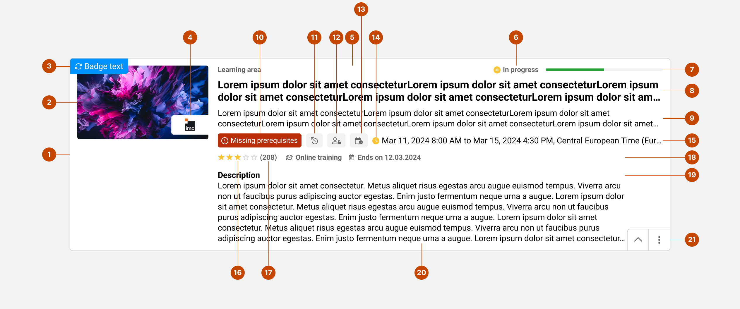
Struktur
-
…
-
Bild – Dient als visueller Anker für das Produkt.
-
Benachrichtigungssymbol – Weist auf neu hinzugefügte oder aktualisierte Inhalte hin; erscheint in der oberen linken Ecke.
-
Logo des Veranstalters – Überlagert das Bild, um das Logo des externen Service Anbieters anzuzeigen. Bei einigen Kartenlayouts wird es möglicherweise neben dem Titel angezeigt.
-
Überordnung / Kategorie / Datum - Ein Platzhalter für zusätzliche Angaben wie das übergeordnete Element (in Suchergebnissen) oder ein Datum (bei News).
-
Nutzer-Status – Zeigt den aktuellen Nutzerstatus (z. B. „In Bearbeitung“, „Erfolgreich abgeschlossen“) oder andere benutzerbezogene Status an.
-
Fortschritt – Ein linearer Fortschrittsbalken, der den Fertigstellungsstatus des Lerners anzeigt.
-
Titel – Vermittelt klar das Hauptthema oder den Zweck der Karte.
-
Untertitel - Bietet zusätzliche Informationen oder Hintergrundwissen zur Erläuterung des Kartentitels.
-
Fehlende Voraussetzungen - Wird angezeigt, wenn ein Nutzer für eine Lerneinheit gebucht ist, diese jedoch aufgrund nicht erfüllter Voraussetzungen nicht starten kann.
-
Beziehungen - Wird angezeigt, wenn der Kurs mit einem anderen Kurs verknüpft ist (z. B. wenn er den Abschluss eines anderen Kurses auslöst).
-
Zeitraum für die Selbstregistrierung - Falls definiert, wird der Zeitraum angezeigt, in dem ein Nutzer sich selbst registrieren kann.
-
Ortszeit - Gibt die für die Zeitplanung von Sitzungen geltende Zeitzone an.
-
Icon für Fälligkeitsdatum - Ein farbiges Icon für die Uhr, das je nach Status des Nutzers die Dringlichkeit des Fälligkeitsdatums anzeigt.
-
Elementstatus - Stellt strukturierte Metadaten bereit, wie beispielsweise Sitzungsdaten, in einer Vorlage verfügbare Komponenten oder Statusbezeichnungen.
-
Bewertung – Zeigt eine durchschnittliche Nutzerbewertung anhand von Sternen an
-
Bewertungen - Gibt die Anzahl der verfügbaren Nutzerbewertungen an. (in Bezug auf die Bewertung)
-
Liste der Immobilien - Zeigt eine Liste der relevanten Eigenschaften oder Attribute an, die mit dem Kartenkontext verknüpft sind
-
Zusätzliche Infoblöcke – Wird selten verwendet, wird angezeigt, wenn die Karte aufklappt: Kurzbeschreibung, Skills und Zertifizierungen.
-
Icon zum Ein- und Ausblenden – Ermöglicht es Nutzern, die Karte zu erweitern, um weitere Informationen anzuzeigen.
-
Menü „Weitere Aktionen“ – Ein vertikales Menü mit weiteren Funktionen für das Element.
Es werden nicht immer alle Elemente angezeigt. Das Layout passt sich je nach Konfiguration und Verfügbarkeit der Inhalte dynamisch an.
Von Grund auf responsiv und barrierefrei gestaltet
-
Alle interaktiven Elemente sind über die Tastatur und mit Screenreadern zugänglich.
-
Auf wichtige Aktionen werden Focus-Zustände, aria-labels und role-Attribute angewendet.
-
Alle Inhalte passen sich der Bildschirmgröße an, ohne dass wichtige Informationen abgeschnitten werden.
-
Die visuelle Struktur sorgt sowohl in der minimierten als auch in der maximierten Ansicht für Übersichtlichkeit und Einheitlichkeit.
Design Notes
-
Das Layout sorgt durch einheitliche Abstände, Ausrichtung und Zwischenräume für einen starken visuellen Rhythmus.
-
Jedes Element hat eine festgelegte maximale Höhe, um einheitliche Kartengrößen für verschiedene Inhaltstypen zu gewährleisten.
-
Die Typografie und der Kontrast sind so gestaltet, dass der Text auf einen Blick gut lesbar ist.
Tipps für ein besseres Erlebnis
-
Es sollten aussagekräftige und einzigartige Titel verwendet werden. Dabei ist darauf zu achten, dass Nutzer den Titel bereits am Anfang von anderen unterscheiden können (es ist zu bedenken, dass Titel nicht immer vollständig sichtbar sind).
-
Bei Bedarf können kurze Untertitel verwendet werden – dabei ist jedoch zu bedenken, dass diese das Layout der Karte komplexer machen, indem sie es um Komplexität erweitern.
-
Hinzufügen von Bildern, die der Erkennung dienen, nicht der Dekoration.
-
Die Metadaten sollten auf die wichtigsten Informationen beschränkt werden, um visuelle Unruhe zu vermeiden. (Konfiguration: Metadaten auf Kachel)
Die Lernkarte bietet eine intelligente und skalierbare Möglichkeit, Lerninhalte zu präsentieren, und verbindet schnellen Zugriff auf Funktionen mit einer übersichtlichen und reaktionsschnellen Benutzeroberfläche, die sich an die Bedürfnisse der Lernenden anpasst.